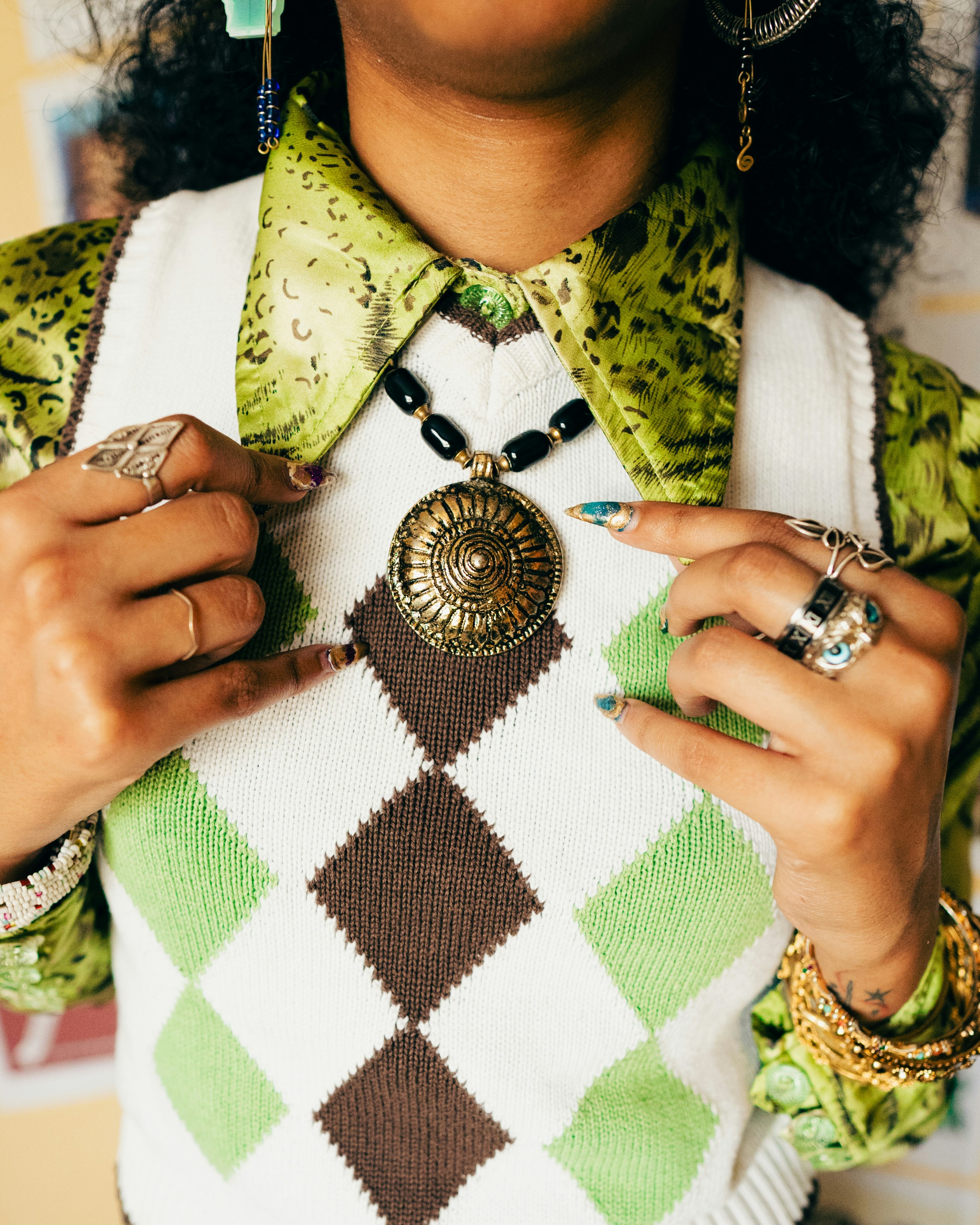
Re-Loved
Overview.
Want to test out the prototype first? Make an offer on the "VIPER leather jacket" and/or upload an item to list on your account.
Re-Loved is an app design born from the desire to shop secondhand seamlessly, support their local communities and reduce global waste whilst extending the life of their beloved possessions.
As the lead UX/UI Designer on this project, I completed the end to end design process: I conducted user surveys; created personas; planned user journeys; turned low-fidelity paper wireframes into high-fidelity digital prototypes and finally conducted usability studies to test the product.


1.1 & 1.2: Four high fidelity Re-Loved mockups.
User research.
First, I conducted a user survey to anchor the project in research. This survey aided in my understanding of the user, their experiences with similar products, their needs and pain points. I removed my own perspective and focused on the user's needs based on data, not assumptions.

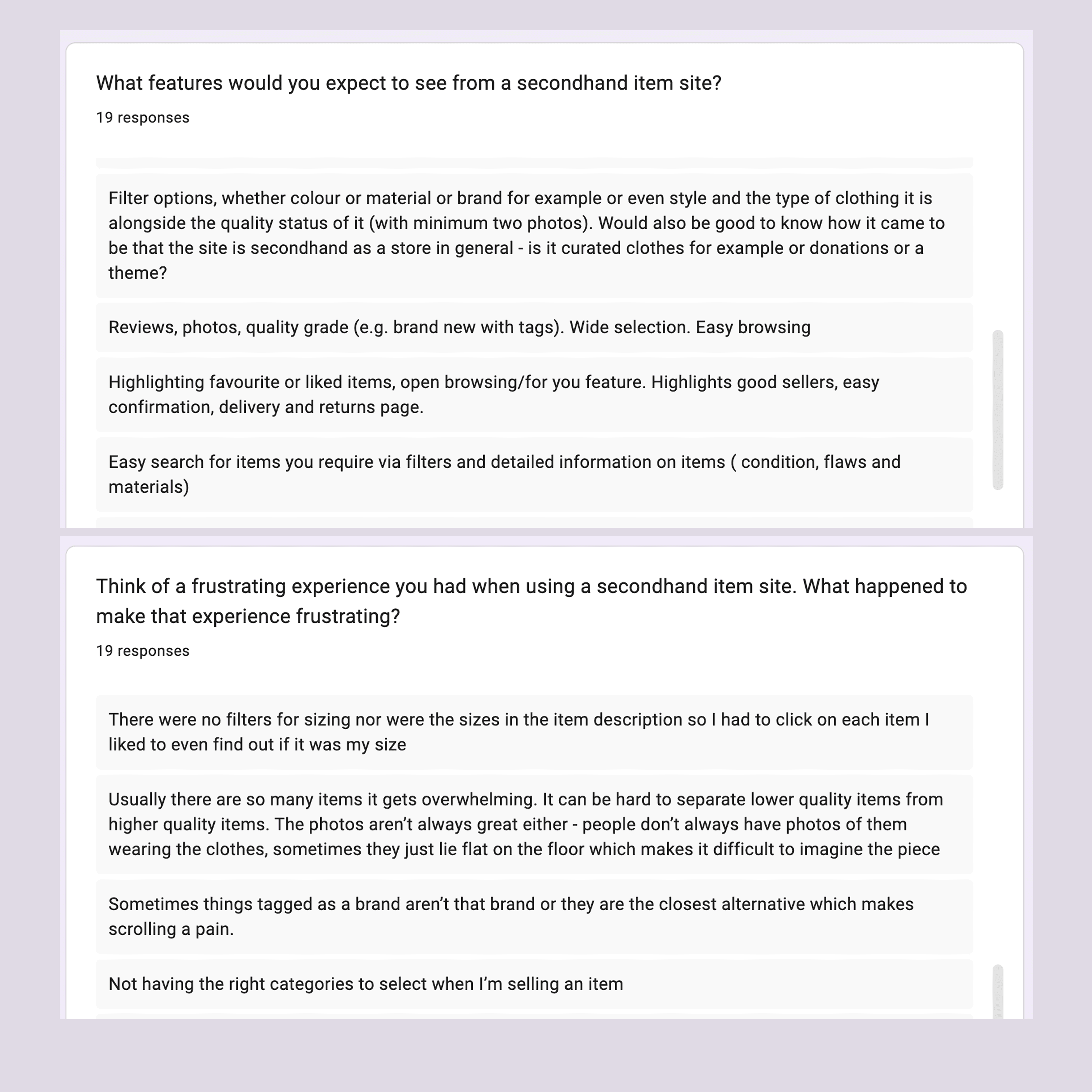
2.1 & 2.2: Survey responses
Next, I consolidated the data into an aggregated affinity map to see emerging thoughts/ patterns and group them together. Using this, I created four personas which became a reference point during the design process.


2.3: Aggregated affinity map
2.4: Personas
Defining the problem.
After all user research was complete, I started to define the user problem. I created user stories and user journey maps for the personas such as:
"As a secondhand app user, I want to be able to filter items by their material so that I can be more intentional with the clothes I purchase".
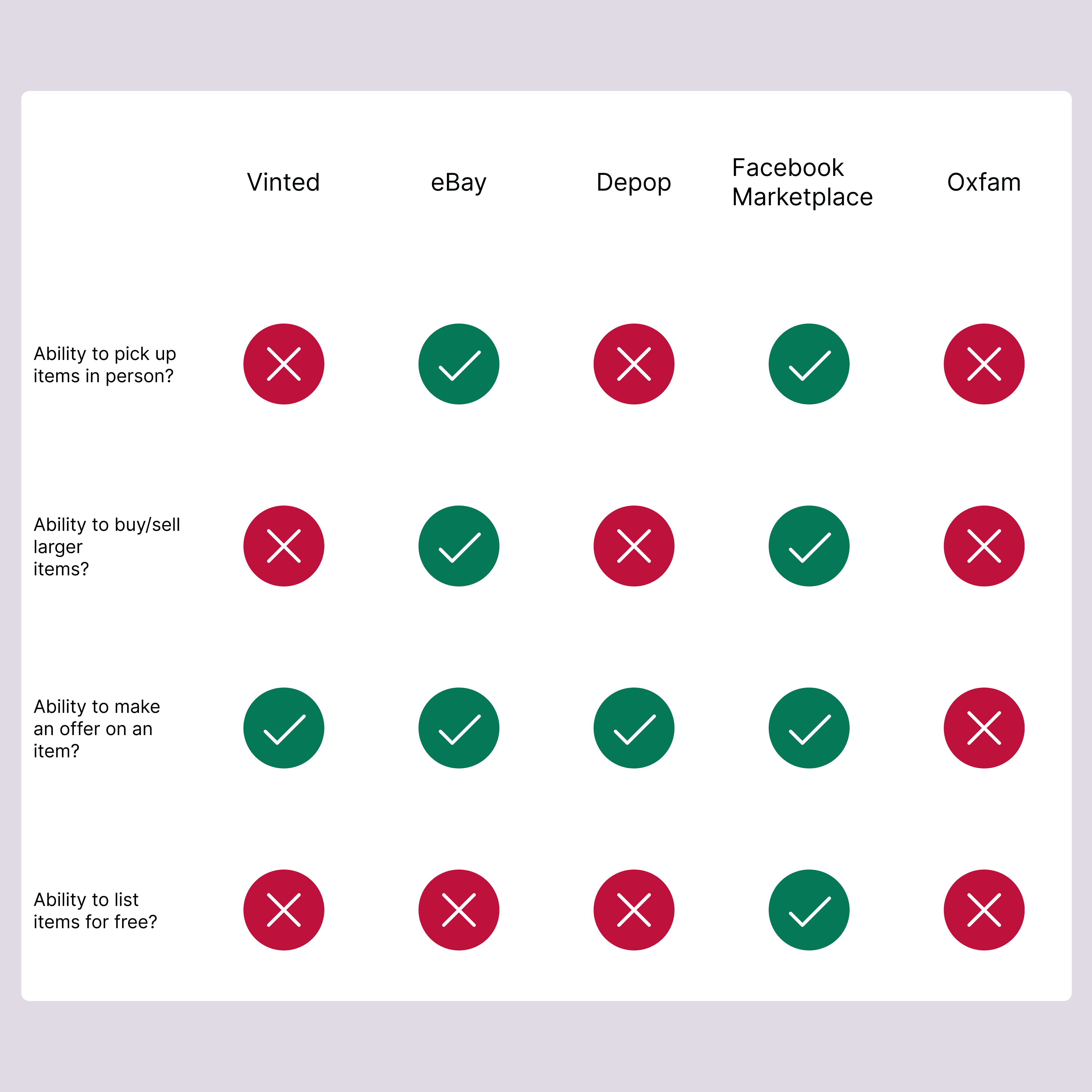
Next, I used the user survey data to establish the primary competitors for a competitive audit. Based on top responses, I audited: Vinted, eBay, DePop, Facebook Marketplace and Oxfam.

3.1: User journey map
3.2 Competitive audit
I compared the user flows for purchasing and listing items for each competitors and analysed what worked vs what could be improved upon. For example, Vinted’s upload flow was surprisingly simple as users only needed to fill in the title, description, category and price to upload. In contrast, eBay’s flow included the above fields plus several more complex categorisation fields depending on the item type such as insole material for shoes. This allowed users to find more niche/specific items when searching.
I concluded that the upload flow for Re-Loved needed to be simple enough for the user that wants to efficiently re-home their items but also needed to be expansive enough for the user who needs to hunt for specific items already in mind.
Ideation.
Once the problem was defined, I got started on the solution. I sketched five versions of each frame in the main user flow and then distilled the best ideas into one frame. I used these version one wireframes to translate the designs into low fidelity digital wireframes.


4.1 & 4.2: Paper wireframes
At this stage, I conducted the first usability study to ensure that the main user flow worked. After implementing feedback from participants, I proceeded to create the high fidelity mockups.
Reflecting back on the personas, I did not believe that the filtering overlay was in depth enough for the user looking for specific items so I overhauled the design and gave this frame its own dedicated flow.


4.3: Lo-fi & high-fi mockups of the product description page and checkout page
4.4: Lofi & high-fi mockups of the sellers page and the filtering page
At this point, I started creating the design system for Re-Loved to ensure that elements, were consistent, reusable and scalable. Responses from the user survey noted that secondhand apps felt cluttered so I chose typography, layouts and colours that were calming and let the user-focused content speak for itself while the app's design played a supportive role by being clear, intuitive and reducing distractions.
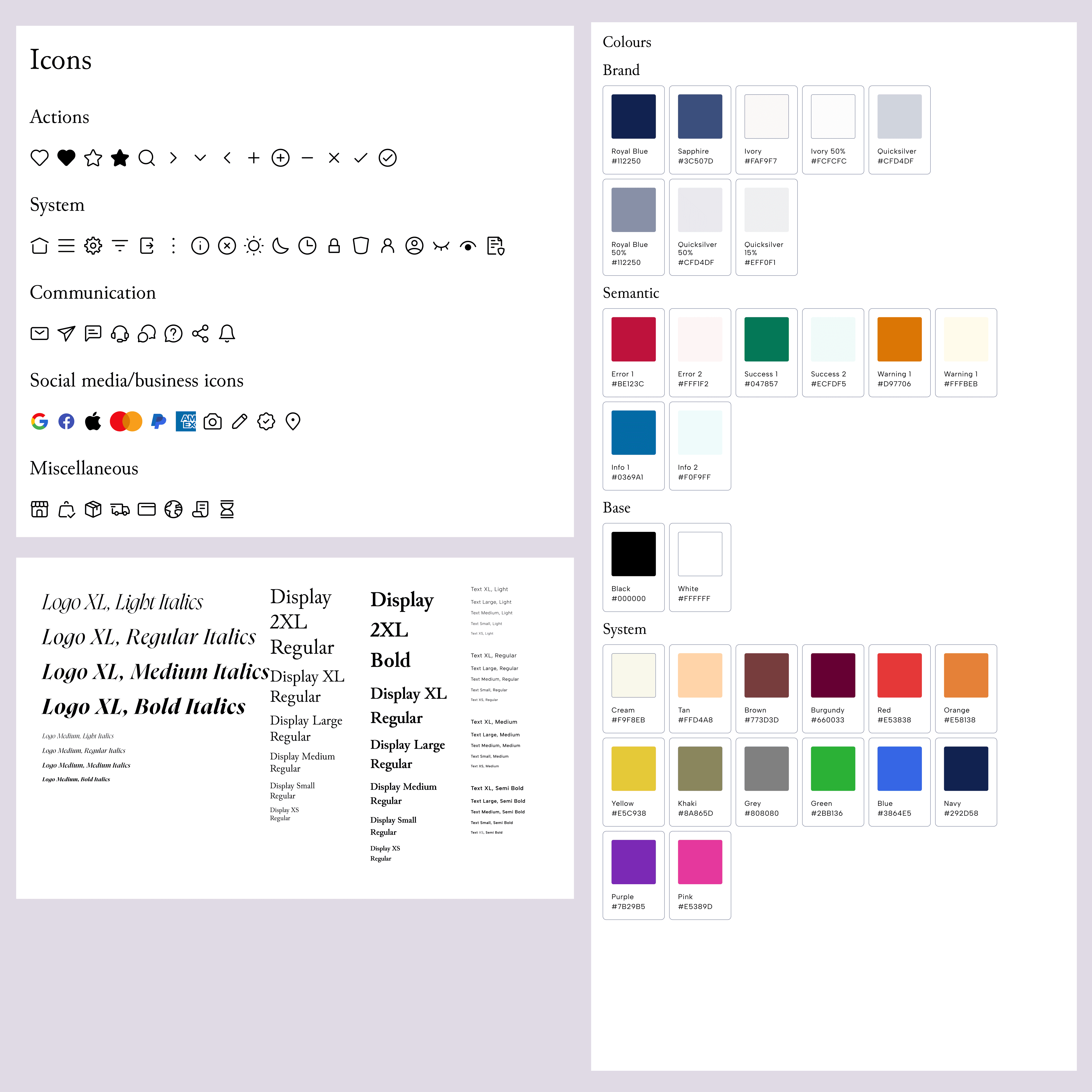

4.5 & 4.6: Re-Loved's design system
Prototyping.
Want to test out the prototype?Make an offer on the "VIPER leather jacket" and/or upload an item to list on your account.
After completing the mockups, I prototyped the design using advanced variables to emulate a realistic user flow without duplicating frames. This included making an offer or purchasing an item outright, selecting delivery options and payment methods and adding form validation with clear error states. By using required fields and conditional button states, users received immediate visual feedback and could only progress once all mandatory fields were filled.
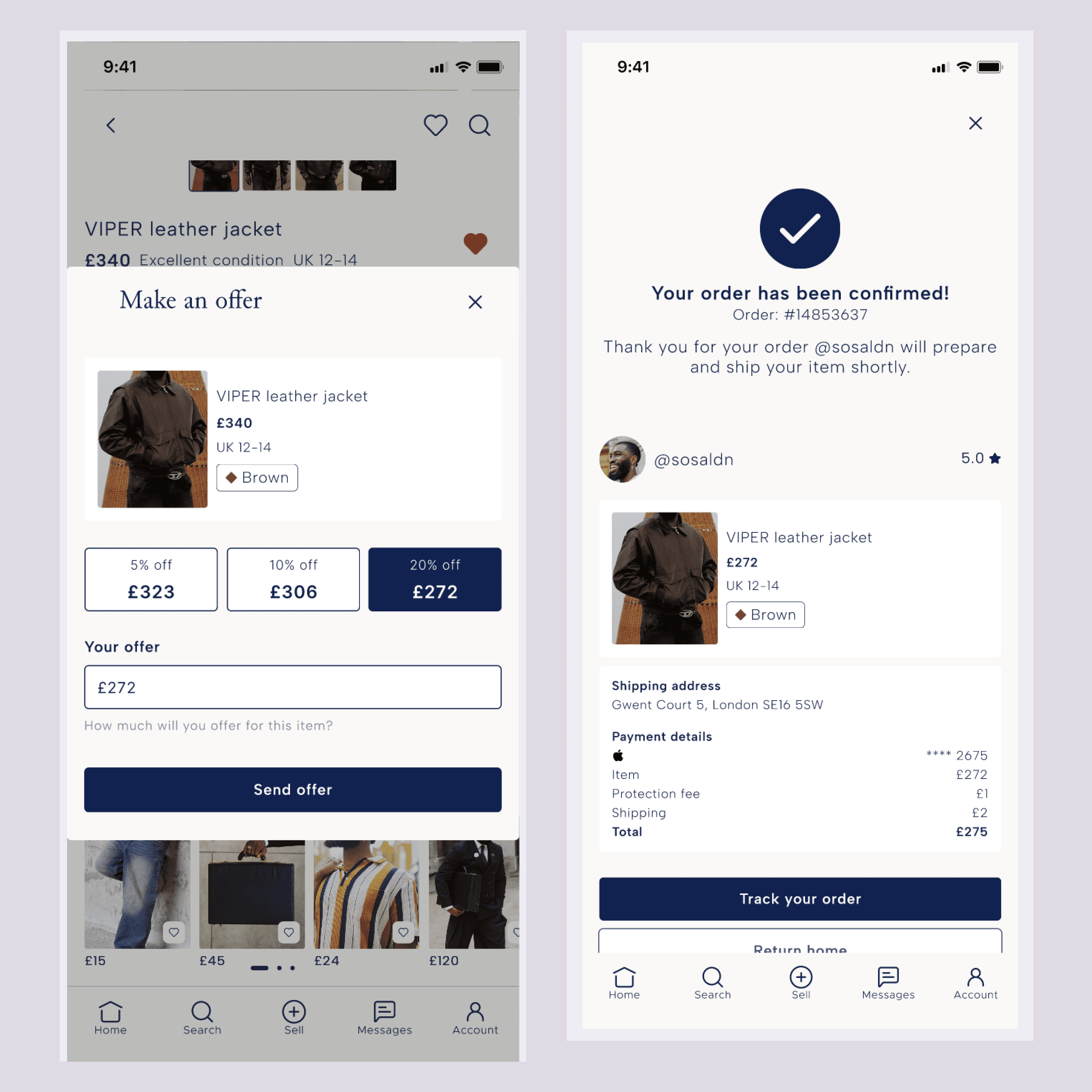

5.1: Make an offer overlay & order confirmed frame
5.2: Checkout frame error states & default My account page
Usability testing.
Once the prototype was ready, I conducted another unmoderated usability test. I asked participants to buy and upload an item, and then leave a seller review.
Using the data from this study, I organised emerging patterns/ problems into high and medium priority issues based on how much the user flow / task completion was impacted. For example, the prototype had an error where the navigation bar would disappear, preventing some users from completing their tasks, this was priority 0 to be fixed.
Priority 1 issues were the fact that 75% of participants expressed difficulty in finding their order history: “It was quite challenging to be honest. I expected my orders to be somewhere on the account’s page” and that 50% of participants felt that some text fields would be better as drop down menus.


6.1: Before & after changing the category and condition fields
6.2: Before & after changing the location of "My orders"
Reflections.
If I were to work on this project again, I would like to conduct a wider array of user research such as interviewing the user base or conducting a moderated usability test so that I can step in if the prototype goes awry.
In terms of prototyping, I would create several separate flows to save time and avoid issues arising from an overly interconnected singular flow. I would also work on creating smaller motion design animations to bring life to the app without distracting the user.
Testimonial.
The app looks like a great idea. Definitely something that should be built.

Otse Obande
Senior Software Engineer
