Amalia's Museum
Overview.
Want to test out the prototype first? Buy tickets to the "Transformation & Destruction" exhibition and then purchase the "Umezawa Manor in Sagmi province" print.
Amalia’s museum is an app and responsive website design based on the following design prompt: Design an app for a public art museum to advertise exhibitions and events, provide museum information to patrons, and enable patrons to schedule visits.
As the lead UX/UI Designer on this project, I completed the end to end design process: I created personas; planned user journeys; turned low-fidelity paper wireframes into high-fidelity digital prototypes and finally conducted usability studies to test the product.


1.1 & 1.2: Four high fidelity mockups of Amalia's Museum.
1.3 & 1.4: Two high fidelity mockups of the responsive website
Personas.
To understand the users' goals, needs, experiences and pain points, I created four personas which I referenced throughout the end to end pipeline. I removed myself and my personal opinions from the process to design from perspectives alternative to my own.


2.1 & 2.2: Personas
Defining the problem.
I created a user journey map to understand how users would interact with the app and to discover opportunities to remove potential pain points. A result of this was optimising the user flow from the initial entry point so users could easily get to their goal without dropping off.


3.1: User journey map
3.2 Competitive audit
Next, I conducted a competitive audit on key competitors. This audit centred on the booking flow of new and returning users and how easy it was to book an exhibition.
The British Museum had the strongest booking process as it was clear, intuitive and easy for users to follow. A standout feature was their “who, what, where” filtering system which allowed users to quickly filter events based on their schedules, family members/ages and interests. In contrast, Kew Gardens’ booking process was the most difficult to complete as selecting tickets was convoluted, potentially leading to increased user errors.
I concluded that Amalia’s Museum needed a straight-forward way to access and book exhibitions.
Ideation.
The problem had been defined and now needed to be solved. I rapidly sketched five variations of each frame on paper, annotated them and combined the best elements into a single paper wireframe. Then, I translated these wireframes into low fidelity digital wireframes using Figma. At this stage, I did not implement typography or colour as I wanted to focus on really strengthening the user flow.


4.1 & 4.2: Paper wireframes
At this stage, I conducted five unmoderated usability tests to tweak the app’s design before committing to anything. Once all feedback was implemented, I created the high fidelity mockups.


4.3: Lo-fi & high-fi mockups of the homepage and store page
4.4: Lofi & high-fi mockups of an exhibition page and initial checkout page
The app's design system was created in tandem with the high-fidelity mockups. This ensured that elements were consistent and brand-aligned. I chose a cream for the app's primary colour. This resembled weathered paper, tying into the historical nature of a museum's content. This was paired with a light olive green as the tertiary to connect the past and present to give the app a modern feel.

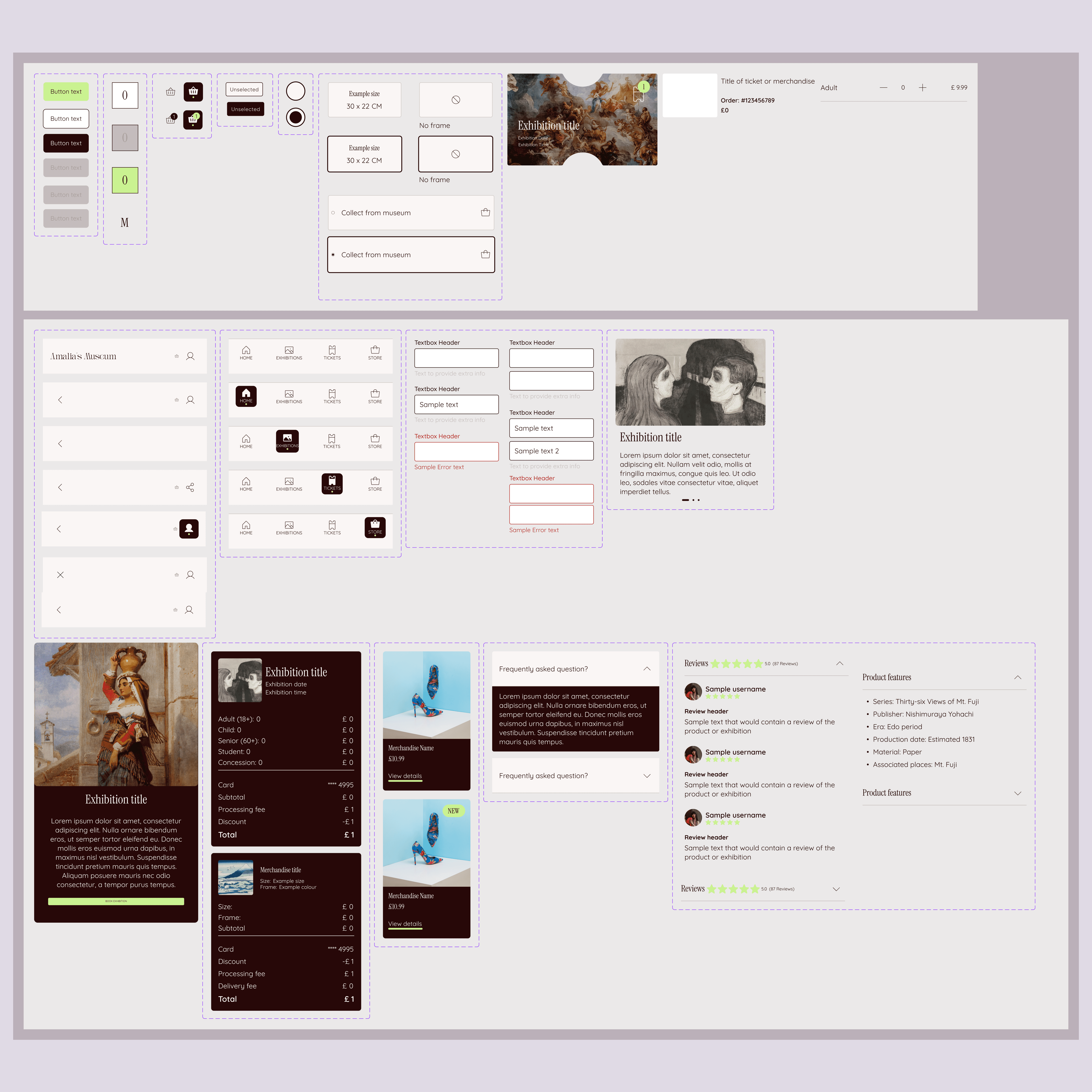
4.5 & 4.6: Design system of Amalia's Museum
Prototyping.
Want to test out the prototype? Buy tickets to the "Transformation & Destruction" exhibition and then purchase the "Umezawa Manor in Sagmi province" print.
I prototyped the design using advanced variables to emulate a realistic user flow without duplicating frames. This included buying up to nine tickets to an exhibition on a date of the user's choosing or purchasing a print with or without a frame. I added form validation with clear error states. By using required fields and conditional button states, users received immediate visual feedback and could only progress once all mandatory fields were filled.


5.1: Checkout page 1 & 2
5.2: Product description page & basket
Usability testing.
After the prototype was finalised, I ran another usability test. I asked participants to purchase tickets to an exhibition and to buy an item from the store. After reviewing all tests, I amended the design. Most notably, a user pointed out that the contrast in the navigation bar might not be high enough. I checked the contrast through WebAIM and unfortunately the contrast ratio was 1.17:1 This failed WCAG's standards for UI elements so this was changed to improve navigation, regardless of the user's environment.
Another amendment was the fact that most users expected to click on the exhibition carousel and be led to the exhibition page. This element was amended so that users could see event information and click through to the intended page, intuitively staying on the happy path.


6.1: Before & after changing the navigation bar to increase contrast
6.2: Before & after updating carousel to be clickable and include exhibition details
Responsive design.
Reflecting back on the personas, I understood that many users would be on the go when searching for tickets so it was imperative that the app had a responsive website counterpart to remove this restriction. I focused on a mobile first design and then moved on to create the desktop version using progressive enhancement.


7.1 & 7.2: Responsive designs on desktop and mobile
Reflections.
If I were to work on this project again I would like to conduct a wider array of user research such as interviewing the user base or conducting a moderated usability test so that I can acquire primary research from the user. Additionally, I would test the designs in several environments such as direct sunlight so that I can check contrast works for all users in all contexts.
Testimonial.
It looks really sleek, really professional. It fits really well the tone of what you'd expect an art museum app to look like.

James Carr
Engineering Manager